The Vardaam Ethos
A Journey Toward Alignment
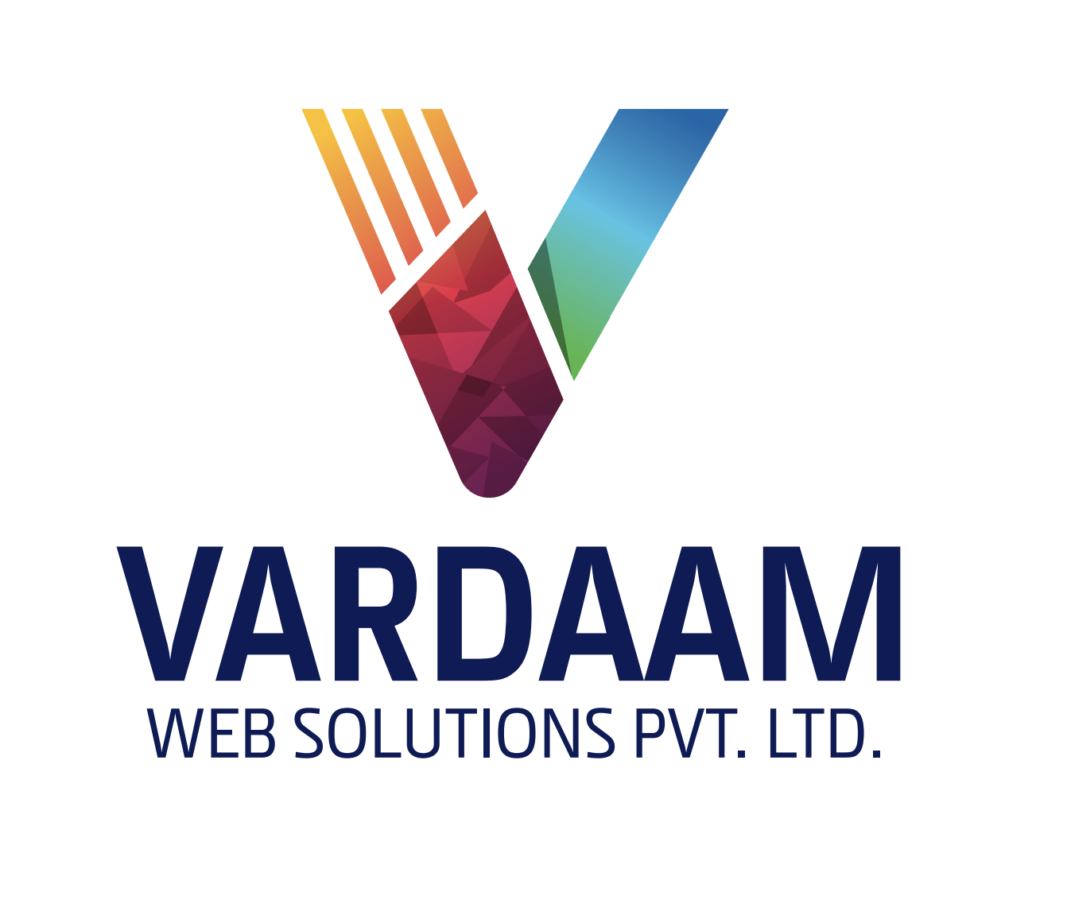
For a long time, Vardaam already had a logo.
It lived with us across platforms, documents, and conversations for years. It carried the weight of our early recognition and supported the company through its foundational chapters. Yet, each time I paused to look at it closely, an open question began to form in my mind—a question about alignment.
While the logo reflected the origin of our name, my attention had begun to shift toward what the company was becoming. Vardaam had grown, evolved, and matured; I sensed that our visual identity was finally ready to grow alongside us.
Old Vardaam logo (V + palm/mudra)
The Philosophy of the Name
The name Vardaam is rooted in classical Sanskrit and inspired by Lord Shiva’s Ardhanarishvara form. It draws specifically from the Varad Mudra—a symbolic gesture representing a continuous state of granting.
This isn’t just a static act; it is a state of being that exists in the present, moment after moment, driven by consistency and intention. As the company evolved, this meaning began to guide my leadership more consciously. I started seeing “Vardaam” less as a brand name and more as a responsibility—one that demands continuity, effort, and progress.
Gradually, the idea took shape: our logo could do more than reference where we came from. It could reflect where we are going.
The Path to Discovery
I explored this thought through multiple perspectives.
Initially, I sought the expertise of professional logo designers. These conversations yielded valuable insights and provided a structured framework for the process. Each interaction refined my understanding and sharpened the questions I was asking. But over time, those questions became more specific—and more personal.
I felt drawn to explore the subject more deeply on my own. I began studying the “science” of identity: how enduring logos accumulate value over decades, how clarity strengthens recognition, and how restraint amplifies meaning. I became fascinated by the idea that a single, well-expressed thought can create lasting recall.
This phase resulted in countless pages of sketches, diagrams, and notes. The process itself became a form of meditation; each page moved my thinking forward until the confusion settled into clarity.
sketches and brainstorming notes for the Vardaam logo redesign process
The Insight: Shared Progress
One insight remained consistent throughout my research: Vardaam grows through shared progress.
Our journey is not a solo endeavor. It involves three distinct stakeholders moving forward in unison: The Client, The Company, and The People building it. When these three forces align, growth becomes balanced, sustainable, and powerful.
That understanding became the “North Star” for the logo’s final direction.

Technical construction of the Vardaam logo on graph paper showing the three strokes of growth
Visualizing Direction, Not Decoration
I began visualizing movement rather than symbols. I wanted to represent direction rather than mere decoration—a form of progress that advances steadily and collectively.
Three strokes emerged, rising upward at the exact same angle. Each stroke represents the growth of one stakeholder, all moving in perfect harmony. When I placed the design on graph paper, the logic became immediately self-explanatory. The math matched the mission.
At that moment, the logo felt complete.
The new Vardaam logo represents shared progress between clients, the company, and people
A Reflection of Purpose
Today, the Vardaam logo reflects exactly where we stand and how we move forward. It carries simplicity, intention, and direction. It aligns naturally with our name’s ancient meaning and the modern values that guide our organization every day.
The new Vardaam logo represents shared progress between clients, the company, and people
A Personal Note
I am sharing this journey as a personal reflection because some decisions cannot be rushed. They must unfold gradually, maturing alongside the person making them. Over time, wondering turns into understanding, and understanding settles into clarity.
The images above capture this journey more honestly than words ever could. They show how the present form of Vardaam came into being—patiently, thoughtfully, and with a singular purpose.
— A Founder’s Reflection by Chetan Chitte