Our Identity
Meaning & Direction
For a long time, Vardaam already had a logo.
It lived with us across platforms, documents, conversations, and years. It carried recognition and familiarity, and it supported the company through its early chapters. Yet each time I paused and looked at it closely, I felt an open question quietly forming in my mind — a question about alignment.
The logo reflected the origin of the name well, but over time, my attention shifted toward what the company itself was becoming. Vardaam had grown, evolved, and matured, and I sensed that its visual identity was ready to grow alongside it.
Old Vardaam logo (V + palm/mudra)
Rooted in classical Sanskrit and inspired by Lord Shiva’s Ardhanarishvara form, it draws from the Varad Mudra — a gesture that represents a continuous state of granting. A state that exists in the present, moment after moment, with consistency and intention.
As the company evolved, this meaning began to guide my thinking more consciously. I started seeing Vardaam less as a name and more as a responsibility — one that invites continuity, effort, and progress.
Direction Over Origin
Conversations with experienced logo designers yielded valuable insights and a professional structure for the process. Each interaction refined my understanding and sharpened the questions I was asking.
The Exploration
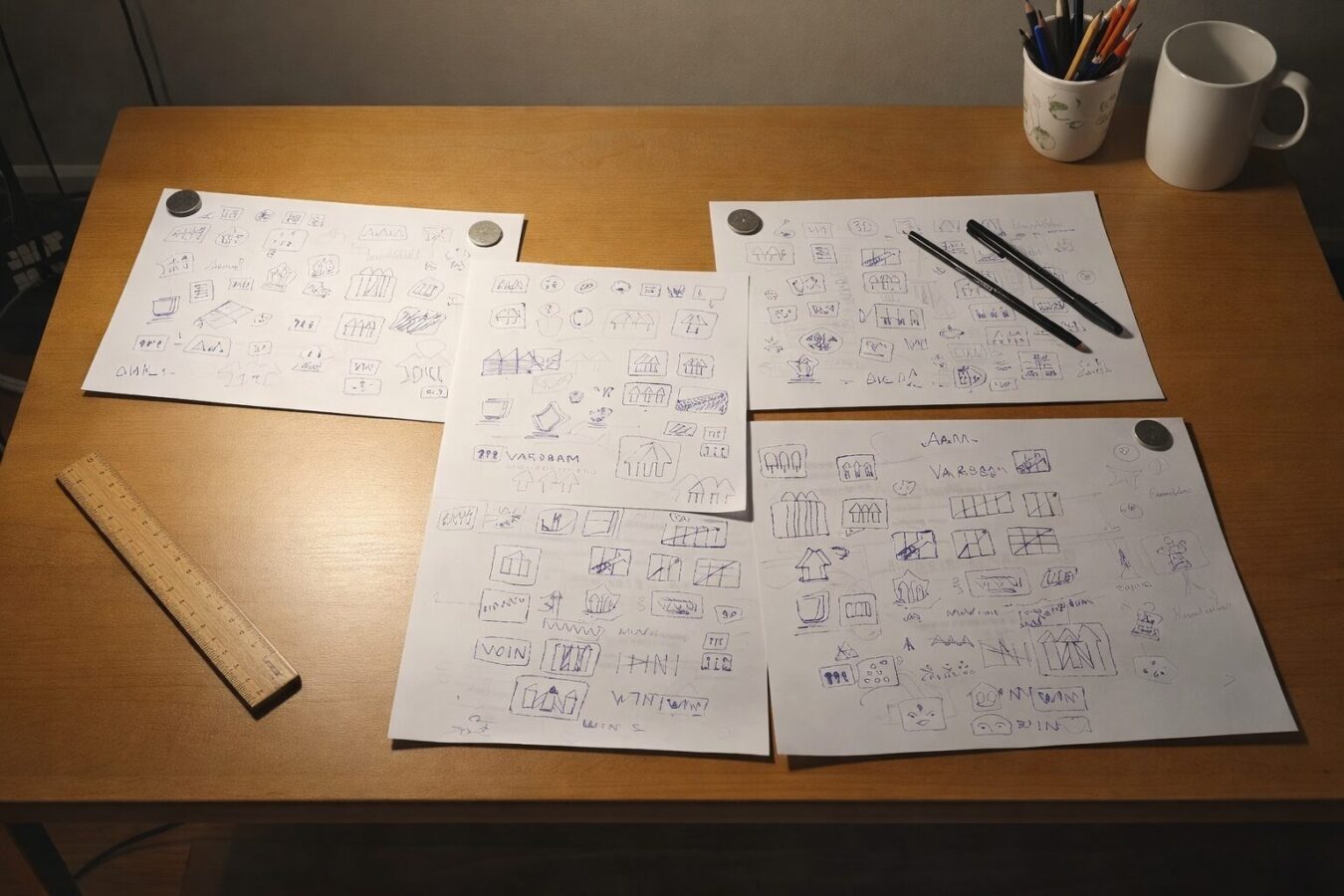
This phase brought with it many pages of sketches, diagrams, and notes. Each page moved the thinking forward. The process itself became a form of clarity.
That understanding shaped the logo’s final direction.
Three strokes emerged, rising upward at the same angle. Each stroke represents growth for one stakeholder, all moving in harmony.
The Moment of Clarity
When placed on graph paper, the idea became immediately self-explanatory.

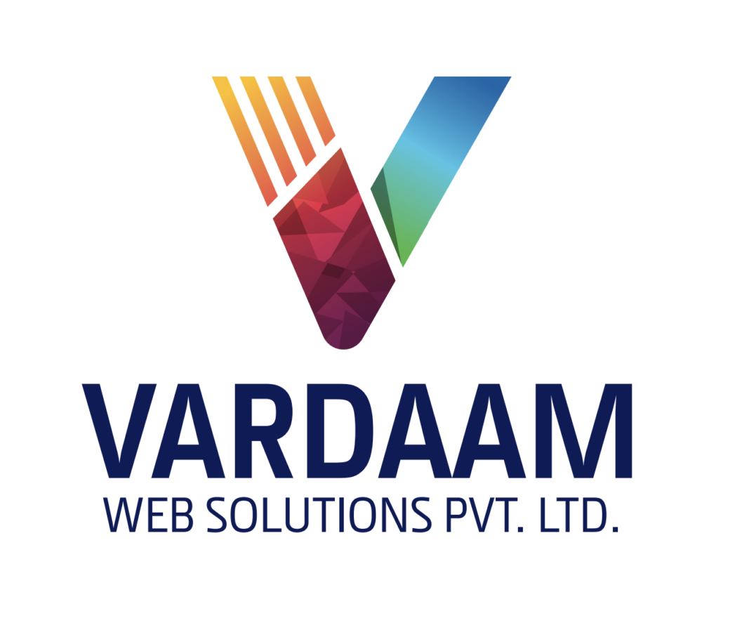
Today, the Vardaam logo reflects where the company stands and how it moves forward. It carries simplicity, intention, and direction. It aligns naturally with the name’s meaning and the values that guide the organisation.
A Personal Reflection
The images above capture that journey more honestly than words ever could.